Transforms
- With CSS3 came new ways to position and alter elements. Now general layout techniques can be revisited with alternative ways to size, position, and change elements. All of these new techniques are made possible by the transform property.

Transform Syntax
- The actual syntax for the transform property is quite simple, including the transform property followed by the value. The value specifies the transform type followed by a specific amount inside parentheses.
div {
  -webkit-transform: scale(1.5);
     -moz-transform: scale(1.5);
       -o-transform: scale(1.5);
          transform: scale(1.5);
}
- 2D Cube Demo:
- HTML:
<div class="cube">
  <figure class="side top">1</figure>
  <figure class="side left">2</figure>
  <figure class="side right">3</figure>
</div>
CSS:
.cube {
  position: relative;
}
.side {
  height: 95px;
  position: absolute;
  width: 95px;
}
.top {
  background: #9acc53;
  transform: rotate(-45deg) skew(15deg, 15deg);
}
.left {
  background: #8ec63f;
  transform: rotate(15deg) skew(15deg, 15deg) translate(-50%, 100%);
}
.right {
  background: #80b239;
  transform: rotate(-15deg) skew(-15deg, -15deg) translate(50%, 100%);
}
Transitions & Animations:
-
One evolution with CSS3 was the ability to write behaviors for transitions and animations. Front end developers have been asking for the ability to design these interactions within HTML and CSS, without the use of JavaScript or Flash, for years. Now their wish has come true.
- Shorthand Transitions:
- Declaring every transition property individually can become quite intensive, especially with vendor prefixes. Fortunately there is a shorthand property, transition, capable of supporting all of these different properties and values. Using the transition value alone, you can set every transition value in the order of transition-property, transition-duration, transition-timing-function, and lastly transition-delay. Do not use commas with these values unless you are identifying numerous transitions.
- 8 SIMPLE CSS3 TRANSITIONS THAT WILL WOW YOUR USERS:
- Fade in.
- Change color.
- Grow & Shrink.
- Rotate elements.
- Square to circle.
- 3D shadow.
- Swing.
- Inset border.
- buttons:

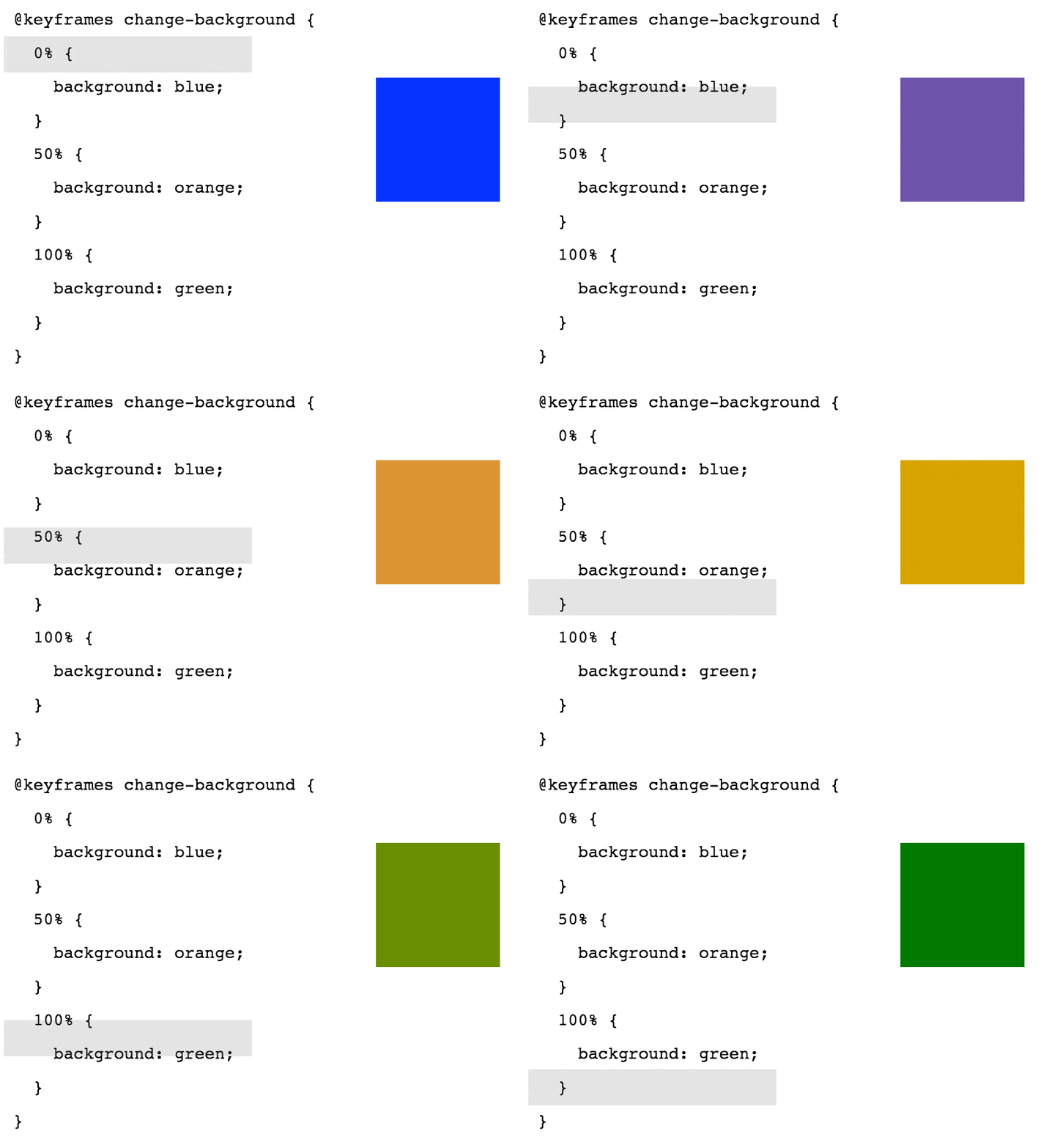
- CSS3 Animations: Keyframes:
- The @keyframes Rule: When you specify CSS styles inside the @keyframes rule, the animation will gradually change from the current style to the new style at certain times. To get an animation to work, you must bind the animation to an element.

- 25 creative 404-Error Pages with cool animations:
- If you call up a page that does not (no longer) exist, you are redirected to 404 pages. But that’s not bad, because 404 pages can work wonders with a little creativity, so that visitors don’t leave your site. 404 pages are called this way, because in case a page does not or no longer exist, the server returns the status code 404 to show that the requested page does not (no longer) exist.

for more information please visit CSS Transforms, Transitions, and Animations.